Plans & Devices Redesign - My TELUS App
Overview
Previous Plans & Devices tab did not include any usage information or self-serve activities
UXR showed there was a strong mental connection between usage and customer’s plans
Usage exists in its own tab, along with all usage-related self-serve activities
Solution: Add a usage bar and other optimized self-serve actions to the Plans & Devices screen to consolidate Usage with P&D and ultimately streamline the user’s journey
Problem
Current usage page design is outdated
IA was confusing and didn’t make sense
Developers and product team wanted to sunset the usage page
Customers were looking for usage information on their plans page
Usage

Plans & Devices

One-stop shop for all usage and plan-related tasks
Implement usage-related self-serve actions into the Plans & Devices tab of My TELUS app
Goals
Make a case for removing the usage tab from the bottom nav by consolidating information and rebuilding select pages in React Native
Solution

Wireframing and Auditing
Explored many different approaches, including reimaginations and north star solutions
Picked an approach based on our own knowledge of how the customer base uses the app
Various rounds of review with leads and colleagues
UX Research
After aligning on an approach, we conducted moderated testing with 10 participants to see if users understood our new design approach
Received feedback on the addition of the usage bar, CTAs, and subscriber selection on the Plans & Devices screen
Results pointed out flaws in our approach, which led us to pivot and implement feedback into our design
Final Design
We took our learnings from UXR, multiple review sessions and feedback sessions to refine our approach
Our final design had the following additions/changes:
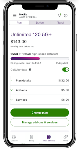
A usage bar was added to the plans and devices screen, along with a cellular data toggle
Multiple self-serve CTAs from the current usage page were added to P&D, allowing users to manage their data and view their usage records from the P&D experience
The main addition of this redesign was adding the usage bar on P&D, which we hope helps customers with recognition rather than recall when all the primary information they need is accessed and viewed on one screen, streamlining the mobile experience for them